KP Fellows 2019 Design Challenge (Finalist)

Overview: This is was completed for my KP Design Fellows Summer 2019 application. My choice of Instacart is born from my experiences as an Instacart user and a roommate frustrated with the experience of splitting bills fairly and transparently.
Outcome: Improved Instacart’s Group Carts feature by adding an easier way to to split grocery bills.
Skill(s): UI/UX Design
Tool(s): Adobe XD, GV Design Sprint
Time duration: 4 months
How’s my share of the bill $65?? I am soo not paying for your weird capellini pasta!
— Frustrated roommate
01. Establishing Context
As a busy college student with 3 busy roommates, Instacart is an invaluable part of my life and is crucial to how I get things done. My experience using Instacart in this context became the root of my proposed feature idea.
As cash strapped students with similar food tastes, our Instacart experience goes a bit like this:
- We often buy our Instacart groceries from one account and with the roommate who has Instacart Express (we all split the cost on it) handling this.
- We order common household groceries together and then communicate, what other personal items we’d like to buy.
- Once our order has been placed, we begin the tedious task of fairly and transparently splitting the bills so everyone pays for only what they bought (house groceries and any personal items).
What if splitting the bill could be handled as part of our checkout process?
It is here that my idea of exploring a way to introduce fairness, transparency, and delight into the bill splitting process after an Instacart order for multi-person households starts.
Due to the time constraint, I focused on tighter iteration and feedback cycles. It was my goal to understand the problem, ideate possible solutions, iterate through designs, quickly test them and understand where they fell short.
I should also note that this is not the only problem I explored. I also looked at solving problems like:
- Instacart Order Genius: Augmenting the discovery experience with a personal assistant that suggests items to buy based on dietary preferences, health goals, and previous orders. I didn’t progress with this idea any further because I couldn’t find any solid data that suggested users needed help with this and quantifying any benefit to the business in the short term proved difficult.
- Improving the shopper experience: The most immediate issue was I did not know any Instacart Shoppers nor did I have access to the app beyond screenshots. I believe it is a problem worth solving and solving well. If I were to tackle this in the future, I would love to do it with an opportunity to listen with empathy and explore a range of solutions as this concerns the livelihood of people. The time constraint for this challenge meant I needed to know what I couldn’t do as well.
02. Who am I solving for?
I began my process of understanding the people and stories behind this problem by speaking to 4 of my friends who had roommates. This gave me much-needed insight into how groups of people shop both on and off the Instacart platform. I focused my discussions with them around the following things:
- How often they used it for personal vs house groceries? (house groceries is defined here as items for group consumption).
- Why the did or didn’t use the Instacart platform to shop for group groceries
- If they did- How often they use it?
- If the didn’t- I briefly explored why that was the case to explore any other opportunities to improve the Instacart experience.
- How and using what methods is the cost split between roommates when groceries are done?
Insights and Learnings
I learned that over half of the roommates I spoke to had either heard of, currently used or planned to use Instacart in the future.
From those that did use Instacart for roommate shopping, I learned these about their process of settling a bill:
- They split the bill using a calculator on their phone or pen and paper. The cognitive load needed to complete this task came up frequently as a reason for less than stellar Instacart shopping experience.
- Paying back the roommate who made the order was done by paying in cash (adding an extra layer of complexity to the roommate who ordered- for example, this needs to be deposited in a bank account) or,
- They used online payment options like Interac E-transfer or Venmo.
- They did not use the number of bill splitting apps on the app store. They highlighted that they required a line by line breakdown of the order details or a picture of the receipt in order to be remotely useful.
Ultimately, their current process is inconvenient- roommates forgot to pay (leading to a very awkward discussion about owed money). It is also generally inefficient for large grocery orders.
The average time it took roommates to split the bill on a large order (involving personal and household items) from Instacart was 10–15 minutes.
Users felt it was easier to switch back to in-person shopping where they could pay for personal items in person and save the hassle, this caused additional concerns on how that behaviour affected affinity for the platform.
03. Problem Definition
Now that I had an understanding of who I was designing for and the problems they faced, I could accurately frame the problem. I went a step further, attempting to frame it as though I were a designer at Instacart.
A product manager at Instacart has identified that roommates are using the Instacart platform to shop for large orders of household and personal groceries. Upon further investigation, a key problem has been identified, they struggle with splitting the bill fairly, transparently and efficiently after a large order. This is causing their number of repeat orders to drop.
Design an experience for roommates to easily split and settle large grocery order bills from within the Instacart app.
04. Design Process
Once I felt I had accurately framed the problem. I find it valuable to get my initial thoughts out into the world as a way to categorize what I am very sure of, fairly sure of and uncertain of. These take of the form of probing, purposefully open-ended questions.
Whiteboarding


Design Audit
Performing design audits are a key part of my design process. They provide key insight into how the problem is currently being solved and gives me a starting point for understanding how it can be improved. For this, I audited Uber, Splitwise and Instacart’s Group Carts.


Analyzing the flows of these systems I learned that:
- Uber has incredibly simplified the process of splitting an Uber ride with a friend. Not having to think about how to settle the bill adds an extra layer of delight to the experience that keeps users coming back.
- Splitwise is an example of the proverbial killing an ant with a sledgehammer. It’s clear to see why someone attempting to use it to split an Instacart bill might be overwhelmed. It takes away the cognitive load of doing the math on a split but adds a new challenge of understanding a complex interface.
- Instacart Group Carts presents a prime opportunity to solve this bill splitting issue. There are a number of concerns I identified while auditing the current flow with users. By far the biggest one was that it was not clear who would be paying the bill. One can see how a perceived lack of transparency can cause hesitation in placing an order. It is not clear who will be charged with the bill (The “Place Order” button was active for both users in the group cart), and the system offers no remediation for settling that bill within the app.
05. Solution
With an understanding of the landscape of products both inside and outside the Instacart, it became clear to me that the best approach to solving the problem of transparency and convenience in group carts on Instacart would be leveraging the existing interface users to demystify how bill splitting and settlement would work.
I set out with a 3 clearly defined goals for my designs drawing from the higher level goal of transparency and convenience:
- Clearly show which users are paying as early as possible.
- If a split is occurring- Show how the split is occurring and offer clear ways to alter that split.
- Show what the total and individual charges as transparently as possible.
Introducing Transparency into Group Carts
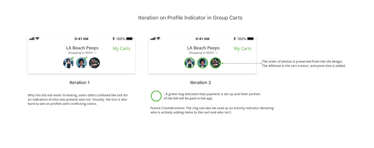
My most crucial changes were made in the Group Carts page. To achieve the goal of showing the members of a group cart who is paying as early as possible, I introduced profile indicators in the form of a ring around the profile picture of the group cart members. This ring indicates which users have payments set up and will be charged their cost of the order directly from the app. In the photo below, I expand on other iterations.
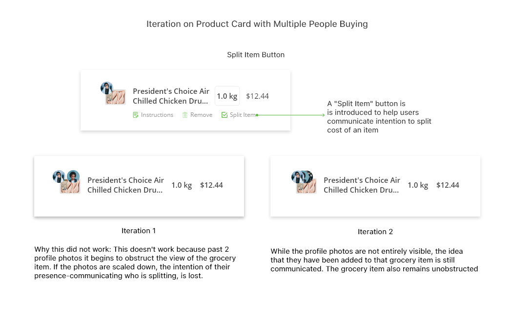
Handling splitting grocery items.
Now that I had established a way for users to quickly deduce how payments would be handled in the cart. I had to tackle how splits on grocery items would be displayed. I achieved this in 2 ways:
- I introduced a “Split Item” option in the grocery item card. By doing this I reduced an interaction that involves multiple conversations to the convenience of tapping a button.
- Layering the profile photos of those that were splitting on the grocery item to show who had opted in to split the bill. I made this decision because while it reduces the visibility of the profile photos, it still communicates the idea of multiple people slitting a grocery item and does not obstruct the item itself. In the figure below, I explain the rationale behind these decisions in more detail below.
Adding clarity to the Checkout Button Lastly, I redesigned the checkout button with an emphasis on clearly highlighting what an individuals part of the total cost would be.

06. Bringing it all together
Redesign of Standard Group Cart and Group Cart with Item Split.

07. Wrapping up
Without any official research about how Instacart chooses to design its product, it was difficult to approach any designs that would mean changing core functions. Rather, I drew from my personal experiences using the app.
Group Cart is a feature I use often and I focused on a few specific changes that would drastically improve the experience using the app. Adding profile indicators, a simple system for bill splitting and improving the checkout button all proved to be changes that brought a much-needed breath of life to what can be a very impactful feature.
Given more time and with a bit more data, I would love to test the bill splitting feature observing the advantages and disadvantages of using the system with a broader set of people. I tried to remain objective and critical throughout the process but any designer can attest that without your users you are flying blind.
I really enjoyed the challenge of this project, exploring the Instacart product, learning about its users and ultimately improving myself.